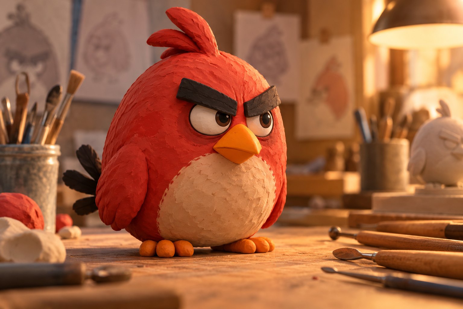
Red’s redesign in The Angry Birds Movie 3 raises a question more interesting than whether he looks different: how much can an animated character change while still feeling like himself? Variety’s coverage of the film’s visual-effects supervisor brings together the redesign and character-effects automation under a revealing phrase: “He’s similar by choice.” Familiarity, in that formulation, is an artistic decision.
That is a useful starting point for examining the film’s visual ambitions. A recognizable face gives a sequel continuity, but recognition alone cannot carry a performance. The challenge is to preserve the qualities audiences associate with Red while allowing expressions, gestures, and reactions to feel specific to the moment.
This is spoiler-free production commentary, not a review of the finished film. The reported subjects support a discussion of character design and craft; they do not establish particular scenes, dialogue, or story outcomes. Any assessment of the movie’s dramatic success must depend on the movie itself.
What “similar by choice” means for Red
A redesign does not necessarily announce itself through an obvious new silhouette or a radically different face. In principle, artists can reconsider how a character works while preserving the features that make him recognizable. The visible result may feel familiar even when the decisions behind it deserve fresh scrutiny.
For Red, the critical question is how that familiarity functions emotionally. His name, color, and emphatic facial design establish a strong first impression. But a sustained performance needs room inside that impression. A face associated with irritation should also be capable of registering uncertainty, embarrassment, attention, or relief without seeming to belong to somebody else.
Those are possibilities for performance, not claims about his journey in the third film. They explain why judging a redesign through a single promotional image can be limiting. A still can show proportions and surface detail. It cannot reveal the timing of a reaction or the way an expression changes when another character speaks.
My view is that a successful update should make Red easier to read without making every feeling obvious. An expression that leaves us briefly unsure whether he is offended or worried can be more engaging than one that delivers a perfectly polished emotional label.
A familiar face needs more than one emotional register
From a character-centered perspective, anger becomes interesting when we understand its purpose. Is it an immediate response to frustration, a way of asserting control, or a defense against being misunderstood? Those questions offer a framework for watching Red; they should not be mistaken for a synopsis of this sequel.
The same outward expression can carry different meanings depending on posture, eye direction, and timing. A lowered brow accompanied by direct attention reads differently from a lowered brow paired with a glance away. Animation can make that distinction visible before dialogue explains anything.
This is where design becomes part of characterization. If the face always returns to the same emphatic arrangement, the audience may recognize the character instantly but learn little about his changing state of mind. If it accommodates small variations, a familiar design can support a surprising response.
The adaptation problem also appears in our discussion of why recognizable game characters need more than a convincing resemblance. Appearance establishes the connection. Behavior has to sustain it. For Red, that means the design deserves to be judged in motion and in relation to other characters.
How character effects can influence a performance
Character-effects automation sounds like a topic for production specialists, yet its relevance to viewers is straightforward: supporting movement can influence how a body feels on screen. As a general animation concept, secondary motion includes the way a flexible surface continues moving after the main action has stopped.
Imagine a hypothetical animated bird turning abruptly. The turn supplies the primary action; the settling of its plumage can reinforce speed, softness, or weight. This is an illustrative example, not a description of a shot in The Angry Birds Movie 3.

Such movement can also affect emphasis. A restrained response might keep our attention on the eyes. A more pronounced flutter might extend a physical joke. Neither approach is inherently better; its value depends on what the scene wants us to notice.
For a strongly stylized character, physical plausibility is only one consideration. A movement can look convincing and still weaken a comic beat by continuing too long or pulling attention away from the face. My preference is for effects that clarify an action’s intention, even when the most effective choice is subtle enough to escape conscious notice.
Automation is a production method, not a verdict
The reference to automation invites both enthusiasm and suspicion, but neither response tells us much about the finished performance. The existence of an automated process does not establish how much artistic control remains available, which exceptions require intervention, or whether a particular result serves the scene.
It is also important to keep the claim precise. Automating character-effects work does not, by itself, mean automating a character’s acting. Nor does the word establish that generative artificial intelligence was involved. Those would be separate claims requiring separate evidence.
The useful critical question is whether the process accommodates expressive differences. A sudden stop, a cautious movement, and an exaggerated comic gesture should not feel interchangeable simply because they share a consistent surface treatment. Consistency helps a character inhabit the same world across shots; variation makes individual moments worth watching.
Production news therefore gives us a question to investigate, rather than an advance quality rating. The same distinction informs our analysis of what a screenplay announcement can actually tell audiences: a creative milestone matters, but it cannot substitute for the experience of a completed film.
What to watch for in Red’s eventual performance
A useful assessment can begin with three things: whether emotions remain readable during quick movement, whether reactions have distinct rhythms, and whether visual detail directs attention toward the character’s choices. These criteria connect the redesign to storytelling without assuming that greater complexity automatically produces greater feeling.
Quiet moments may be especially revealing. Broad action makes an immediate impression, but a pause can show whether a design supports thought. Watch where Red looks, how long he holds an expression, and whether his body anticipates or contradicts what his face appears to say.
The deeper issue: continuity without emotional repetition
The most promising interpretation of “similar by choice” is that continuity can create room for discovery. When viewers already recognize a character, a small departure from expected behavior can become meaningful. The familiar appearance provides the reference point that makes the difference register.
That is the standard I would bring to The Angry Birds Movie 3. Red’s redesign should ultimately matter because it helps us understand him in a particular moment. The strongest achievement would be a character who remains immediately recognizable while giving the audience something new to notice beneath that familiar expression.
Original content by this site's editorial team. Published: October 18, 2026 at 07:44:29 PDT (Los Angeles time)